Categories
Let's tableau it the IBCS way

Dynamic dates in your Tableau sheet title

Mini-Series «Let’s tableau it the IBCS way! »

IBCS is a consistent source of visual best practices and probably the deepest in Business Intelligence.


A title gives us orientation on what the content below is about. This is why an informative title is important. This is why IBCS advise naming at least organisational unit(s), measure(s), and period(s). It is easy to show organisational units and measures dynamically in a title. But it is hard to show dynamic dates in your Tableau sheet title.

Categories
Let's tableau it the IBCS way

How to unify dynamic scales in Tableau

Mini-Series «Let’s tableau it the IBCS way! »

IBCS is a consistent source of visual best practices and probably the deepest in Business Intelligence.


One of the major concerns of the International Business Communication Standards (IBCS) is the lack of unified scales for KPIs of the same entity. If we do not unify the scales our visualisations will be misleading. No wonder this is also one of the major concerns in data visualisation. This post shows you how to unify dynamic scales in Tableau.

Categories
Compositional Weight Design

Why heavily coloured backgrounds waste time

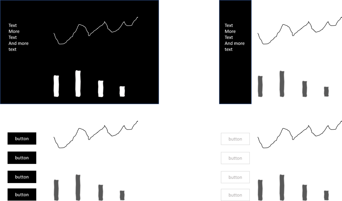
There is something I observe quite often in information dashboard design. It is the use of dark backgrounds or highly saturated colour backgrounds for menus. The intention is clear. The designer wants to make content or the dashboard as a whole pop out. Therefore she or he puts a lot of compositional weight on the background or the background of the element which should pop out. While it does not look bad, there are three good reasons why you should avoid dark backgrounds in information design.

Categories
Communication Comprehensibility

The force of white space

Use white space wisely in your dashboard design as it is very powerful to deliver a dashboard that shines thanks to its excellent user experience.

Categories
Communication Semantics

Think twice – is it important, is it attractive?

Halfway through my studies in media and communication science a technology called Macromedia Flash was evolving. I noticed that web designers used a significant amount of their time to make very nice-looking animations. The only problem was they did not transport any information. Something without any importance draws our attention. The designers forgot about the information design rule #1: form follows function. At the same time, there were designers who leveraged flash to animate information graphics which really made complex things easy to understand. One good example was an animation of biochemical processes in the human body. So something very important draws our attention. Animation made it possible plus attractive.

Categories
Compositional Weight

Compositional weight and how it makes colour practically needless

In data visualisation, there are many blog posts about colour. It is something very mighty if it is used correctly. Poorly applied colour can ruin the best dashboard. So, what if there was an alternative which is universally understandable?

Categories
Communication Comprehensibility Semantics

Mind the triangle

Without semantics, design is just an empty shell. Semantics covers the relationship between a sign and its meaning. So, always keep the triangle of meaning in mind.

Categories
Communication Comprehensibility

KISSSS or how to design dashboards for faster insights

Dashboard design tools are dangerous. They equip you with a massive orchestra of instruments. It makes it very hard not to end up with cacophony. Becoming an outstanding conductor takes a lot of practice, mistakes, and feedback. As in music, there are rules which you first need to learn before you break them intentionally.

x  Powerful Protection for WordPress, from Shield Security
This Site Is Protected By
Shield Security