In data visualisation, there are many blog posts about colour. It is something very mighty if it is used correctly. Poorly applied colour can ruin the best dashboard. So, what if there was an alternative which is universally understandable?
When I taught a class of future photographers about visual communication and composition I got familiar with a concept in photography called compositional weight. Photographer Ben Long introduces it on Lynda.com. In photography compositional weight is about the balance of the subject and objects.
Skip the cultural connotation of the colour
We discuss photos regarding how artful they appear. The art of photography in my eyes is if the photo tells a story and the viewer gets it without further explanation. Information dashboards we discuss mainly considering their allowance for fast insights. At least that is the idea of an information dashboard, right?
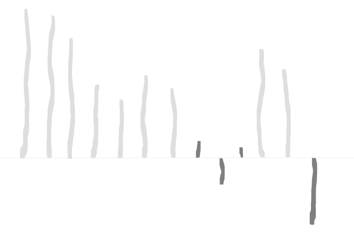
In this regard, there is something about the compositional weight that is of higher interest than the balance. It is how we perceive contrast. The more contrast an object has, the more it pops out, and the more attention we give it. Other than the interpretation of colour, whether it means bad or luck, the perception of contrast does not depend on a cultural imprint. It is universal. And you won’t have to deal with contradictions between cultural meaning and corporate meaning. Let’s pretend red is the corporate colour and exactly this red gets used for all the bad profit on a dashboard. At least the marketers will get red heads.
So working with the compositional weight seems to be a good practice.
Get the insights fast
As dashboard designers we direct the limited attention of users to the points they need to spend attention on. That is anything bad which needs action. Plus the concept allows being in line with Tuftes data-ink-ratio and standards of safe design for colour-blind people. Will colourless dashboards look boring to some eyes? They for sure will. But do dashboards rather have to entertain or do they have to allow one to get insights fast while not getting distracted by any clutter?
By the way. My photography class had to do all pictures about composition in black and white so that colours would not distract from the composition itself.
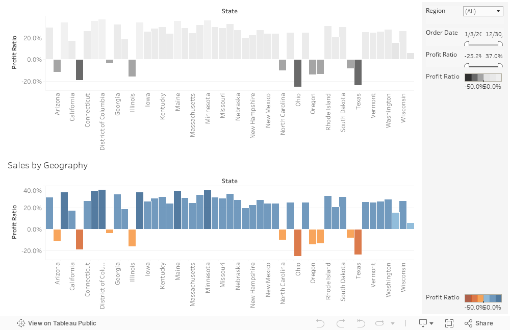
How does it look? Well, take a look.
For the full experience watch the dashboard on a desktop or laptop on Tableau Public.