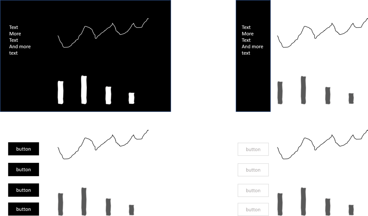
There is something I observe quite often in information dashboard design. It is the use of dark backgrounds or highly saturated colour backgrounds for menus. The intention is clear. The designer wants to make content or the dashboard as a whole pop out. Therefore she or he puts a lot of compositional weight on the background or the background of the element which should pop out. While it does not look bad, there are three good reasons why you should avoid dark backgrounds in information design.
Time spent on the wrong parts
If a menu attracts too much attention – and with a heavy background it will – it steals away the attention from the important part of every dashboard: the data visualisation. We only have one attention at a time.
Time to process it
The second problem is that any background colour other than white takes additional human CPU to process; the more the darker the colour. It is almost as difficult to read white text on a black background as it is to read it upside down. You don’t believe me?

Did you notice how the version with the black background slowed your performance down? Even if you use just a small amount of time to process it still makes a significant difference if you have many users or many buttons to read.
Time to build and maintain it
Plus there is another reason to go for the good old standard of black on white. It is the maintenance factor. The white background is standard for most Business Intelligence and design tools. There is no need to set it. As a result, you use less time to achieve a well-designed end result.
Three times time wasted
So let’s conclude why should you avoid dark backgrounds in information design. There is no time wasted attracting the user to the wrong spot, no human processing time wasted and no development/maintenance time wasted. Those are good reasons to resist the temptation of being too sophisticated.


2 replies on “Why heavily coloured backgrounds waste time”
I’m not against dark backgrounds on graphical displays in general. I personally don’t prefer them.
My personal reason is based on color theory and the significant importance of color in graphs. Use them wisely, as the mantra goes.
They do take a toll on cognitive CPU for the audience to process.
Why then, are they trendy? And just because they are trendy, doesn´t mean they are proper for understanding information effectively.
Why are they trendy? Great question. I think it is because some designing individuals are cultivating it.