Categories
Design

Colour in Dashboard Design

When it comes to designing a dashboard, colour is an essential element. It can help to highlight important information, make data more visually appealing and guide users to the information they need.

Categories
Design

Lost in Decorations

We all like to look at supermodels, no matter their gender. It’s very pleasing to look at them as they look perfect. However, things can get a bit out of control after a while. We feel frustrated with ourselves and try to copy those photoshopped ideals. Some of us go wild and take plastic surgeries or cover our faces with makeup or expensive creams to get close to the photoshopped artificial hyperrealism thrown at us from all channels imaginable.

Categories
Let's tableau it the IBCS way

What’s not yet possible in Tableau without an extension

Mini-Series «Let’s tableau it the IBCS way! »

IBCS is a consistent source of visual best practices and probably the deepest in Business Intelligence.


It’s not the intention of this mini-series to be 100 per cent IBCS compliant. However, IBCS offers a lot of good concepts to make your dashboard more valuable in terms of human performance, in terms of condensed information, and terms of orientation on the business questions instead of the data.

Categories
Let's tableau it the IBCS way

Tableau charts the IBCS way

Mini-Series «Let’s tableau it the IBCS way! »

IBCS is a consistent source of visual best practices and probably the deepest in Business Intelligence.


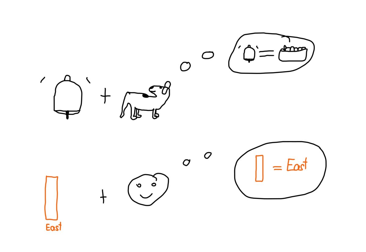
One thing many like about Tableau is its flexibility. You could do any visualisation you can dream of. Plus, it is a lot of fun, once you figured it out. But should you do that in a business context? I am convinced the answer is no. Stakeholders who ask for entertaining elements on dashboards do not understand what information dashboards are about. Dashboards should point to pain points and ideally allow us to tackle them directly inside the dashboard.

Categories
Let's tableau it the IBCS way

Time belongs on the x-axis, structure belongs on the y-axis

Mini-Series «Let’s tableau it the IBCS way! »

IBCS is a consistent source of visual best practices and probably the deepest in Business Intelligence.


Analytical dimensions are of two types, time and structure. Now, to help users read visualisations faster, let’s display the two types the same way.

Categories
Let's tableau it the IBCS way

Smart labels for lightweight dashboards

Mini-Series «Let’s tableau it the IBCS way! »

IBCS is a consistent source of visual best practices and probably the deepest in Business Intelligence.


Labelling data points is a challenge. However, it is worth taking the challenge and learning the techniques to master it. Smart labelling leads to lightweight dashboards.

Categories
Let's tableau it the IBCS way

How to build a better bullet graph in Tableau

Mini-Series «Let’s tableau it the IBCS way! »

IBCS is a consistent source of visual best practices and probably the deepest in Business Intelligence.


In their book, “SOLID | OUTLINED | HATCHED” Jürgen Faisst and Rolf Hichert dedicated Tableau one and a half pages. They were motivated by the Tableau Whitepaper “Visual Analysis Best Practices”. The whitepaper contains a visually misleading example of a bullet graph. IBCS has a clear suggestion on how to build better bullet graphs.

Categories
Let's tableau it the IBCS way

It’s not all about the data, it’s all about the message

Mini-Series «Let’s tableau it the IBCS way! »

IBCS is a consistent source of visual best practices and probably the deepest in Business Intelligence.


The guys from IBCS say a report without a message is not a report but a collection of data, like a telephone book. I’d say it is an unfair comparison. Telephone books at least own a clearly defined structure. So, “Why are things so bad?”, you might ask.

Categories
Let's tableau it the IBCS way

Highlight differences the IBCS way in Tableau

Mini-Series «Let’s tableau it the IBCS way! »

IBCS is a consistent source of visual best practices and probably the deepest in Business Intelligence.


If we stick with bar and line charts, we have done much to let users get what they see. However, sometimes we would like to add some extra information. The art of visualisation is to do it in a visual and yet direct way.

Categories
Let's tableau it the IBCS way

How to show a scale reference for KPIs of the same unit in Tableau

Mini-Series «Let’s tableau it the IBCS way! »

IBCS is a consistent source of visual best practices and probably the deepest in Business Intelligence.


Sales and profit are measures of the same unit. Tableau will paint the axis independently. But 100k of profit should not look the same as 1000k of sales. As this standard behaviour of Tableau is misleading, here is a call to action.

x  Powerful Protection for WordPress, from Shield Security
This Site Is Protected By
Shield Security