Categories
Communication Compositional Weight Comprehensibility Design Let's learn from Communication Theory Semantics

The Power of Visual Communication: Unlocking Meaningful Data Visualisation

Mini-Series: Let’s learn from Communication Theory

Uncover the hidden power of communication theories on information dashboard design and data analytics in this Mini-Series.


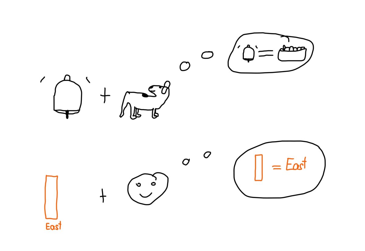
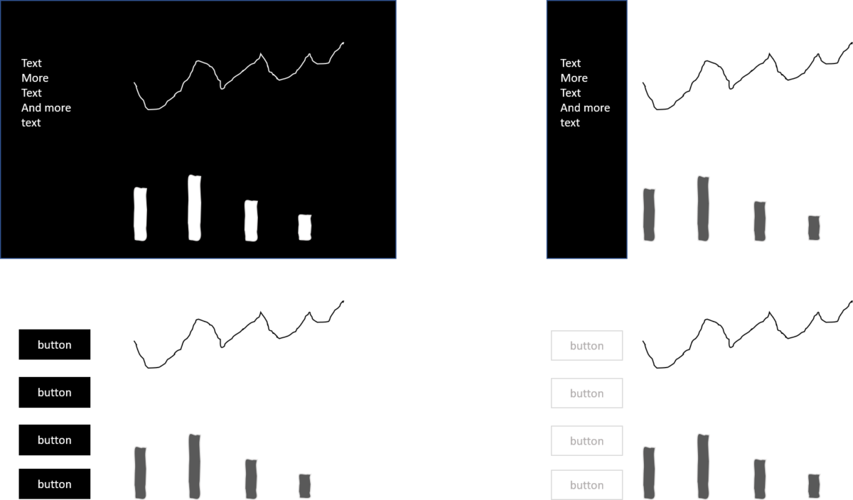
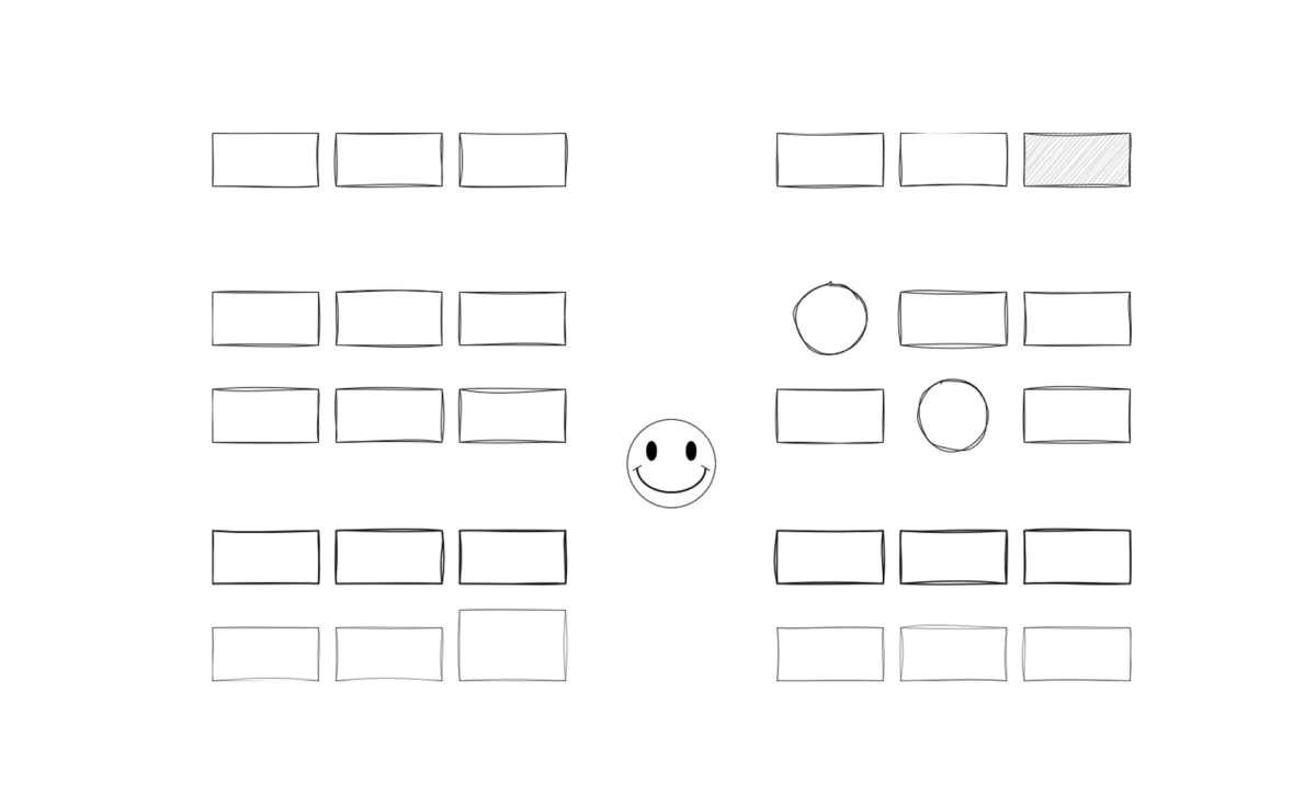
In data visualisation and dashboard development, visual communication plays a pivotal role in conveying complex information effectively. Just like a language has its own vocabulary and grammar, visual communication relies on a profound knowledge of visual elements and their arrangement. This post explores why understanding visual vocabulary and grammar is essential for creating meaningful data visualisations that facilitate information exchange and foster understanding.

Categories
Design

Colour in Dashboard Design

When it comes to designing a dashboard, colour is an essential element. It can help to highlight important information, make data more visually appealing and guide users to the information they need.

Categories
Design

Lost in Decorations

We all like to look at supermodels, no matter their gender. It’s very pleasing to look at them as they look perfect. However, things can get a bit out of control after a while. We feel frustrated with ourselves and try to copy those photoshopped ideals. Some of us go wild and take plastic surgeries or cover our faces with makeup or expensive creams to get close to the photoshopped artificial hyperrealism thrown at us from all channels imaginable.

Categories
Compositional Weight Design

Why heavily coloured backgrounds waste time

There is something I observe quite often in information dashboard design. It is the use of dark backgrounds or highly saturated colour backgrounds for menus. The intention is clear. The designer wants to make content or the dashboard as a whole pop out. Therefore she or he puts a lot of compositional weight on the background or the background of the element which should pop out. While it does not look bad, there are three good reasons why you should avoid dark backgrounds in information design.

x  Powerful Protection for WordPress, from Shield Security
This Site Is Protected By
Shield Security