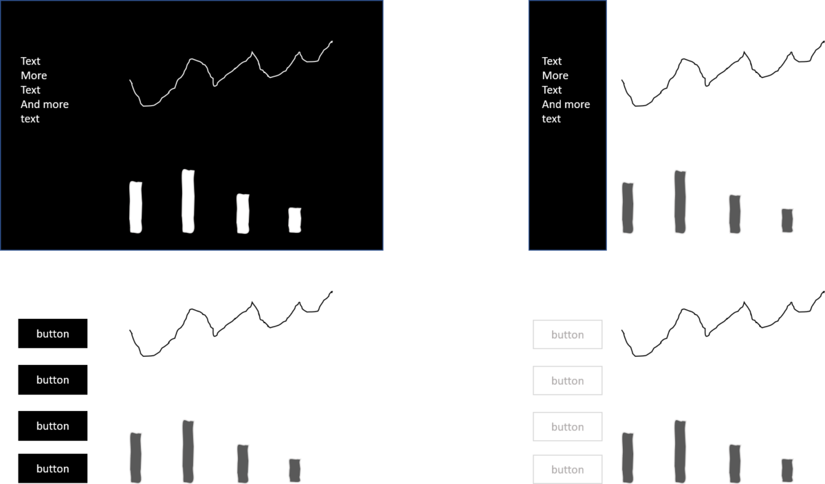
There is something I observe quite often in information dashboard design. It is the use of dark backgrounds or highly saturated colour backgrounds for menus. The intention is clear. The designer wants to make content or the dashboard as a whole pop out. Therefore she or he puts a lot of compositional weight on the background or the background of the element which should pop out. While it does not look bad, there are three good reasons why you should avoid dark backgrounds in information design.


