When it comes to designing a dashboard, colour is an essential element. It can help to highlight important information, make data more visually appealing and guide users to the information they need.
However, the use of colour in dashboard design has challenges.
Atomisation of attention
One such challenge is the atomisation of attention through the use of far too many colours, where three could already be two colours too many. Another challenge is the priming effect, which can make it hard to unlearn the first learned meaning of a colour.
Decondition yourself is hard work
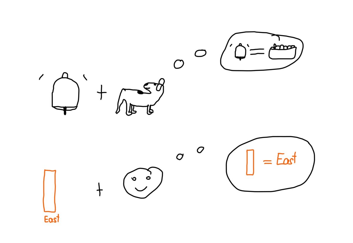
As Pavlov’s dog learned to associate a bell with food, users can learn to associate colours with specific meanings. If purple means the group “over 80 years old” in the first chart we see and the very same purple is used for an entirely other meaning in the second chart, like the region south, we will catch ourselves thinking the south is where the old people are. This might be a little bit true regarding the climate. However, with climate change… You get it: it is misleading. We need to decondition ourselves, which is unnecessarily hard work. You can try the power of priming by pointing to something white and asking: What colour is this? Then repeat by pointing to something else white, then ask again: What colour is this? Then ask: What do cows drink? The answer will most likely be milk.
Colour only what needs attention
To avoid confusion and ensure that colour is used effectively in dashboard design, it is important to use strategies that highlight the information that needs attention. Colour is an attention-grabber, and we have only one attention at a time. Therefore, it is better to use colour to guide users to the information they need to focus on rather than using it for both good and bad things.
Efficient and effective alternative to colour
One effective strategy is to use smilies or compositional weight instead of colour. Use smilies or “sadies” for bad things that need attention. Leaving the happy smilies away makes the fight against “sadies” more efficient, as you don’t get distracted by the smilies. You can put three “sadies” for the very bad, two for the medium bad and one for the slightly bad. Since humans are social creatures, our visual system divides stimuli between face / non-face. We are, therefore, extremely fast and skilled in “face recognition”. This, by the way, is why we also see faces in biscuits and all sorts of other things. Compositional weight, on the other hand, involves using a lot of contrast where attention needs to go and fewer contrasts on good values if the task is to spot bad values quickly.
Across cultural and perceptual barriers
Both smilies and compositional weight are understood the same way globally, in contrast to colours, which have a cultural imprint. By using these strategies, designers can create dashboards that are easy to understand and use, regardless of cultural barriers.
Use colour sparingly and wisely
In summary, colour is a powerful tool in dashboard design. Still, it should be used strategically to avoid confusion and ensure that users can find the information they need quickly and easily. By understanding the priming effect and using effective strategies such as smilies or compositional weight, designers can create dashboards that are fast and easy to understand globally. Plus, you still have colour as a wild card to use, for example, to mark the critical insight of each chart.


