Mini-Series: Let’s learn from Communication Theory
Uncover the hidden power of communication theories on information dashboard design and data analytics in this Mini-Series.
In information dashboard design, words matter just as much as visuals. You might wonder what feminist language has to do with data visualisation. Well, the words we use in dashboards make a big difference in shaping our thoughts and perceptions, especially regarding gender equality.
The Impact of Words
Words have an incredible ability to influence how we see the world. In information dashboards, our chosen language can promote equality or reinforce biases. For instance, consider the use of gender-neutral language. Using terms like “individual” instead of “user” creates a more inclusive atmosphere.
Addressing the Feminine Gender
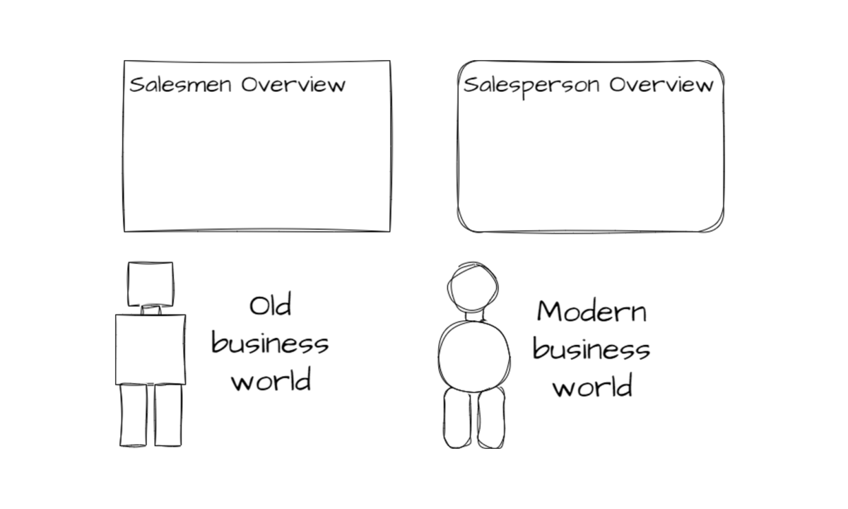
One important aspect of feminist language in information dashboards is addressing the feminine gender. Job titles and roles are often described using masculine terms, like “salesman” or “chairman.” But this can unintentionally discourage women from pursuing those roles, as it may make them feel excluded or unrepresented.
For example, using “salesperson” instead of “salesman” sends a message that anyone, regardless of gender, can excel. This small change can significantly impact how women perceive themselves and their potential job opportunities in sales.
Changing Perceptions
Using feminist language in information dashboards can help change perceptions and promote gender equality. When we see more inclusive words, it sends a message that everyone is welcome and valued. This can encourage women to pursue careers in data analytics, technology, and other traditionally male-dominated fields.
The Language of Forms
Consider the design of forms within information dashboards. Shapes, be it rounded or angular, can carry subtle gender associations. Rounded forms are often perceived as feminine, while angular shapes are inclined towards a masculine impression. However, it’s not always possible to add more rounded shapes to existing dashboards and templates.
Concluding the Main Learnings
In the world of information dashboard design, feminist language extends beyond job titles; it includes design elements, too. While the connections between forms and gender can become complex to implement given existing templates, gender-neutral language is a simple yet effective way to promote inclusivity and gender equality. The words we choose can impact how people perceive themselves and their potential roles. By embracing gender-neutral and inclusive language, we can create a more welcoming and equitable environment in data analytics and all aspects of life. So, the next time you design an information dashboard, remember that the words you choose matter and can shape a more equal future.